SofaSofa
How updating the basket page on one of the UK’s leading online sofa stores resulted in a 77% increase in revenue per visitor
The background
SofaSofa is one of the UK’s leading sofa manufacturers and retailers, whose beautiful sofas are handmade in the UK.
They were investing a lot of money into PPC activity, and competed well against household names for important SEO searches. Their traffic was growing – but their conversion rate was consistently lower than average for the industry.
The website suffered from a high basket drop-off rate across all traffic types. The basket lacked key assurances and needed a UX overhaul, as the shipping calculator was too complicated and we believed this was causing a lot of ‘friction’ on the page, slowing users down in their purchase decision.

What we did
Our psychology-first A/B test led to 85% more conversions
We created a specifically researched and tailored basket page for customers. Using our unique methodology, we tested the original (Version A) against our version (Version B). This included:
- A deep-dive into the page’s analytics, from all channels
- Analysis of on-page behaviour
- Remote user testing
- Prototyping and wireframin
- Design, development, QAing
- A/B split testin
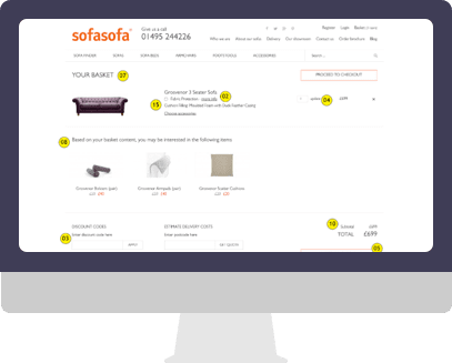
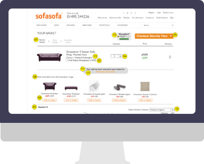
While User testing we found that customers were most concerned about delivery (speed and cost) as well as believing that the company was reputable. Our key changes to the page were around delivery assurances, updating the delivery calculator and ensuring that the cross-selling section promoted more relevant, related products.
BEFORE

AFTER

The results
We experiment ran for 3 weeks and Version B drove:
- +112% more revenue
- +77% more revenue per visitor
- +85% higher conversion rate
- +115% more transactions
The return on investment for this A/B experiment was 2,324% in the 3 months following the experiment.


