Funding Invoice
How our interactive UX design approach gained 19,251 new users for the launch of an innovative invoice finance company
The background
With thousands of businesses in the UK waiting for outstanding payments on their invoices, Funding Invoice provides a fast and effective invoice finance solution to help businesses stay on top of the cash flow.
Starting out in 2015, the company has quickly established itself as one of the UK’s leading invoice finance companies, working closely with fashion brands, retailers, contractors and those providing fast-moving consumer products.
In 2020, Funding Invoice came to Digivate with their vision of creating a high-quality website that matched its esteemed reputation and position in the industry.
We helped redesign the entire digital experience for users to support their mission in maximising enquiries for invoice financing along with supporting their investor product, which allowed businesses to invest in growing SMEs.

What we did
The new Funding Invoice website was built with search engine optimisation (SEO) and user experience (UX) in mind.
We kickstarted the project by focusing on branding and leading a UX workshop with the Funding Invoice team, which highlighted ways we could improve the website and its functionality.
With this approach, we were able to roadmap the entire customer journey and pinpointed key aspects including how people use the site and what would (and would not) make them convert into enquiries.
In terms of design, we opted for a long scrolling style allowing users to journey down the homepage and see different unique selling points and key points of the business proposition.
All the landing pages were mapped out accordingly, with special attention given to putting information above the fold, the amount of text per page, site speed and usability on mobile.
To increase engagement, we included the strapline “Why wait x amount of days for your invoices to be paid” with a ticker on the number of days.
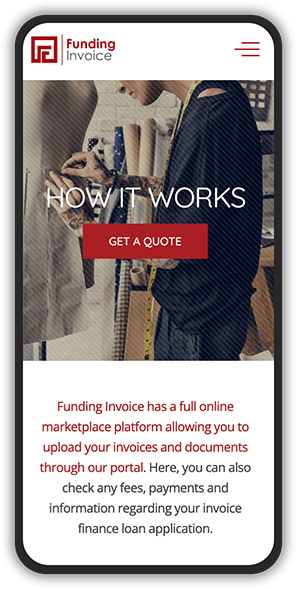
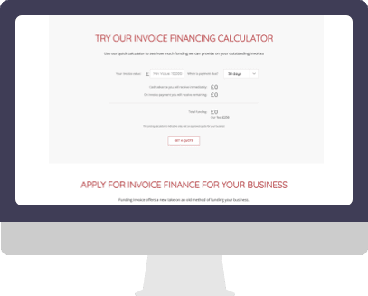
We added some more images of humans and customers to show the close relationship that Funding Invoice has with their customers along with a calculator. Giving users an interactive experience whilst mapping out their borrowing facility and repayments accordingly.
BEFORE

AFTER

The results
The result showed an enormous jump in search positions within the first month of the project going live.
- Attracted 19,251 page users
- Gained 48,905 views


