An effective website shares common goals with its users – and makes it simple for those goals to be achieved. (Possible goals include a sale, a donation, or simply the delivery of information). The goal is what the user wants and it’s the reason for the website’s existence.
Good website design transforms the user experience into something positive, making goal completion easy and pleasurable. This is especially important in specialized fields like web design for higher education, where a well-structured site can significantly enhance student recruitment, engagement, and access to important resources.
Search engines seek to identify websites offering good content and user experience. So design is a vital component of SEO strategy. In fact, incorporating SEO best practices into your website’s design is crucial to ensure your site is easily accessible, user-friendly, and optimized for search engines. To learn more, check out the article on the importance of SEO in web design.
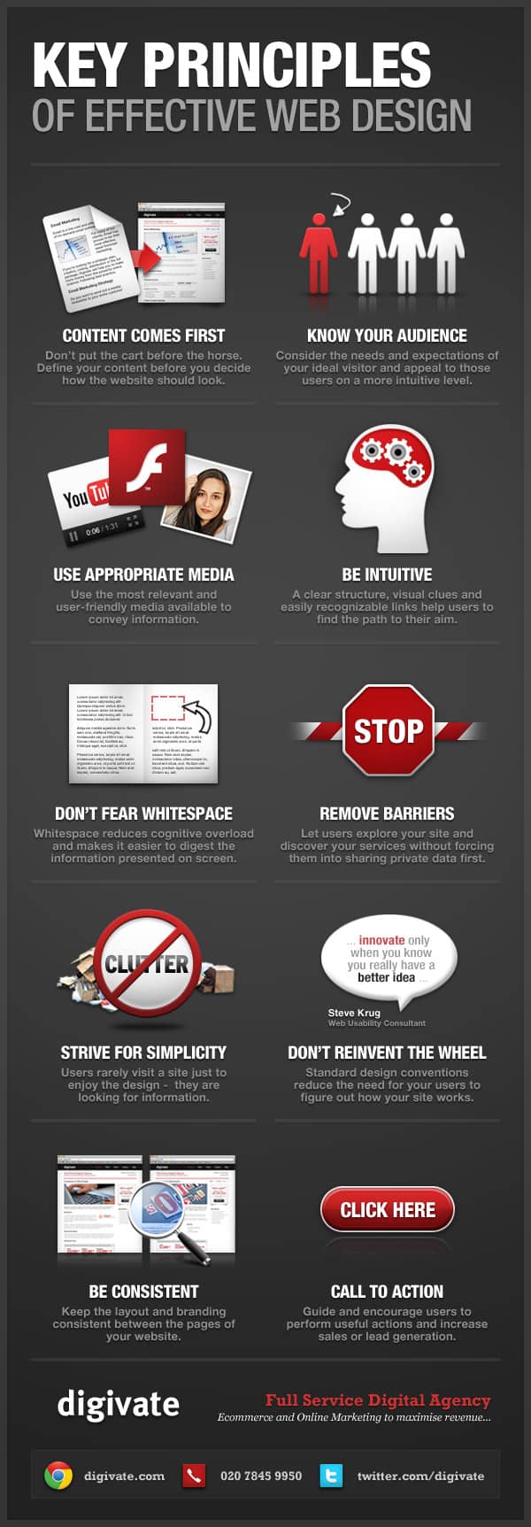
In this infographic Toby Davies, our lead designer, reveals the essence of effective web design using 10 fundamental and eternal principles:

1. Content comes first. Websites exist to deliver content to people and everything about the site should be built around the content and the concept of making it accessible and useful.
2. Know your audience. Without an in-depth understanding of your audience and their needs it’s impossible to develop content that is right for them. For instance, websites like EveryPlate cater to specific needs by offering one-person meal plans, demonstrating how well they understand individuals looking for convenient, single-serving culinary solutions. This alignment between a website’s design and its content strategy ensures that users find what they’re looking for easily and efficiently.
3. Use appropriate media. What’s the best way to deliver the information your audience wants? Text? Video? Maybe a nice infographic?
4. Be Intuitive. Don’t make users struggle to achieve their goals (they’re your goals too!) An intuitive design feels familiar and natural.
5. Don’t fear white space. It never did Google’s homepage any harm. Don’t clutter your website’s pages with visual noise.
6. Remove barriers. Your goal – and the goal of your site – is to sell or provide. The visitor’s goal is to buy or consume. It’s a beautiful harmony. Why would you put barriers in the way? Annoying pop-ups, forms and other unnecessary blockages in the process defeat the whole point of the website.
7. Strive for simplicity. Enough said.
8. Don’t re-invent the wheel. If another site does something excellently, copy it. Don’t try something new unless the old ways are flawed.
9. Be consistent. Variations in layout, branding and other aspects of the user experience are confusing and make it harder for people to use your website effectively.
10. Call to action! This is the whole point of everything on your site. It’s your goal. It’s the website visitor’s goal. So be friendly and invite visitors to act. Make your calls to action clear, obvious and inviting.


