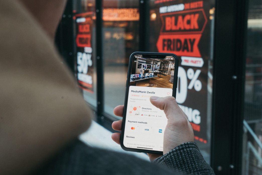
As the digital landscape continues to change the way consumers shop, the significance of online events like Black Friday has increased. The shift from bustling storefronts to virtual storefronts is more evident than ever, making it imperative for online businesses to master the art of Black Friday preparation and optimization.
But before we dive into the nitty-gritty of website optimization, we’ll explore why businesses, now more than ever, should be active participants in this retail extravaganza. Additionally, we’ll take a closer look at some standout examples of Black Friday websites that have mastered the art of online promotion. After all, a little inspiration might be all you need to get your website up to scratch.
What is Black Friday?
Black Friday, originating in the United States, has evolved into a global phenomenon that marks the unofficial beginning of the holiday shopping season. Traditionally falling on the day after Thanksgiving, Black Friday has grown beyond its American roots, influencing consumer behaviour worldwide.
As anyone who has shopped on this day will know, it’s characterised by massive sales and a rush from consumers all trying to get the best price before the item they want sells out.
Why Should Your Business Partake in Black Friday?
While for shoppers it’s all about coupons and sales, for businesses Black Friday is something else. Participating in this day isn’t just about offering discounts; it’s a strategic move that has many benefits for businesses, such as:
- Increased revenue: Black Friday is a huge opportunity for businesses to experience a significant uptick in sales. The sheer volume of shoppers actively seeking deals creates this environment.
- Improved visibility: With consumers actively scouring the internet for deals, businesses that effectively market their promotions can attract a broader audience.
- Customer Acquisition and Retention: Offering compelling deals on Black Friday can be a powerful tool for customer acquisition. Moreover, it provides an opportunity to strengthen relationships with existing customers, fostering loyalty and repeat business.
How to Properly Prepare Your Website for Black Friday
Seasonal sales like Black Friday are huge opportunities for online businesses, with an increasing amount of people opting to shop online during these periods, instead of hitting the high streets. Online retailers and businesses need to ensure they know how to prepare their sites, and ensure they’re running at peak performance to perform well.
This begs the following questions; how do I know what to optimise my site for, and how long before Black Friday/sale season do I need to start preparing for it?
So we did our research, and came up with a handy 5-step action plan, with our recommendations on how to prepare your website for Black Friday.

(img – Pexels)
Step 1 – Gather your Customer Insights
Whether you’re an online retailer, or a market service provider, you should have a solid understanding of how your customers work; why they come to you, when they come to you and what they expect from you. This gives you the ability to react, and in most cases hopefully predict, your customer’s behaviour.
Armed with this insight, we can build a structure allowing you to reap the benefits of Black Friday and future promotion periods.
How we do this at Digivate, is to monitor our client’s site traffic, top landing pages, demographic, etc as part of our monthly reporting service. This all equates to huge amounts of data, giving us insight into the usage of your site, and the most effective ways for you to use this knowledge to your business’ advantage.
For example, we run an analytics audit for all our clients, in order to measure and assess the traffic the site is receiving. You can brief your team on how to do this for their clients themselves, or get in touch with a team of people who can work their magic for you.
Result – Detailed and useful site information on users age, demographic, on-site behaviour, search queries, etc.
TIP: An easy way to keep tabs on your users is to monitor changes in a separate document (we use Excel). Keeping this information separate from the reports is useful for tracking seasonal changes and trends, and is infinitely easier than sorting through pages of unnecessary information.

(img – Pexels)
Step 2 – Communicate Constantly
Your company/brand has its own tone of voice, a tone of voice that should be familiar to your customers by now. This is a crucial element of B2C communications; research into customer loyalty has found that the more familiar and trusted your company’s persona is with your customers, they are far more likely to repeat business with you, and even spend more money.
This is where on-site content and customer communications, such as emails, mailers, advertising, etc comes into play. The more trust your customers have in your company, the more likely they are to come to you for promotions and sales.
This communication element should be an ongoing process, and will give you an excellent head start when it comes to promoting your sales, which your loyal customers are already anticipating.
TIP: Constant marketing doesn’t mean constant promotions, offers, etc. Many companies use their communications with their consumers as a way to make their users feel involved in the business. ASOS and Net-a-Porter for example, use their email marketing strategies to talk about current styles and trends, not exclusively about promotions.
One of the most successful marketing campaigns is one you probably already know of; Dove’s Campaign for Real Beauty.
This campaign did exactly what every brand should do; it looked at the needs and desires (not only personal but also social) of their demographic, and addressed these issues in ways which emboldened their customers. This widened their reach to women who before may have felt side-lined and ignored by Dove’s marketing, and as a result not only increased their profile worldwide, but also increased the company’s revenue by almost double during the campaign.
Result – Engaging and thought-provoking communication with your customers, keeping them happy and satisfied with your service.
Step 3 – Do a Site Audit
Your site is already under constant maintenance (we hope), but in the event of promotions and sale season it is best practice to assess the flow and UX of your website; where you’re drawing traffic into the site, where they’re converting, where they’re dropping out, etc.
This flow of your site is imperative to understanding how your customers use your site, and will give you and your development team flags as to where pages can be optimised to produce the best return for your business.
Agencies like Digivate have programs, methods and tactics constantly monitoring business metrics, watching site traffic levels, conversion rates and more. This enables us to act the minute we see something awry with a business’ analytics, and put the repairs in motion.
Having regular UX tests on your site allows you to experience the highs and lows of using your site as a customer; are there too many pop ups? Not enough filters on category pages? Does it take too long to get from the product page to the checkout? Is the correct information regarding returns and company policy available easily to the customer?
All these issues are small on their own, but compiled together they can cause serious headaches for your site users, resulting in more customers bouncing off your site rather than reaching the checkout page.
I, myself, am an avid Black Friday shopper. I will track prices for at least a month before to make sure I am getting the most bang for my buck. In my experience, if I run into a slow loading website, an unclear checkout process, difficulty finding the product I want, or a coupon code that actually doesn’t work, I am likely to jump ship and look for a similar deal on a different website.
TIP: By now your site should already be HTTP, if not purely because Google said so. Web users are savvy to the security measures taken by companies, and if you’re seen to be late to the security party, they are far less likely to do business with you. They want to know that you are as keen on protecting their personal and payment information as they are, and this is a simple and quick way to reassure them that you are
Result – A comprehensive list of areas to improve on the site, with a strong understanding of how people use your site.
Step 4 – Ensure Key Pages are Optimised
Prior to sale season you’re going to have to ensure that any pages on your site which are sale-specific have been optimised appropriately.
This could be:
- Changing page titles
- Creating new category pages
- Updating meta information
- New sale specific imagery being implemented across the site
- Any image carousels on the homepage that need updating
- Specific returns policy information
- Etc.
TIP: If you’re creating new pages on your site for sale season, make sure that the new pages have been indexed by Google, otherwise people may be searching, but they won’t find your company in the SERPs!
Textual content on the site will need to be created and checked thoroughly as well; any keywords that aren’t in alignment with the sale season strategy should be replaced with ones that are, and engaging site content should be implemented across the site to create customer anticipation for your upcoming sale.
There should also be updates to your product descriptions; ensure that they are informative and fit the tone of your site, have a good paragraph of text so Google can see what you’re selling and probably most importantly ensure that these descriptions are unique, and not ripped from other sites, such as the manufacturer’s site. These will be sniffed out by GoogleBots, and your page will be penalised in the SERPs as a result.
Result – All main sale pages and categories are loaded with accurate content, imagery, meta information, etc.

(Image source – Pexels)
Step 5 – Test Your Site
You must be sure to test your site before sale season starts! This is hugely important, as all the site improvements you’ve already done could be worth nothing if the UX isn’t up to spec.
User Experience (UX) is what is going to attract and retain the users on your site, and a simple A/B Test will be sufficient to see how the site works now, and how it will work after your changes are finalised.
A/B testing is easily organised, and will give you a first-hand experience of what your current site feels like to your users. Going from this, you can put together a well informed and accurate optimisation list for your dev team to make sure the user’s journey from homepage > product page > checkout is a smooth and simple as it can be.
Another key test for your site is mobile responsiveness. Mobile responsiveness refers to a website’s ability to adapt and display effectively on various mobile devices, ensuring a seamless and user-friendly experience across smartphones and tablets.
6 Examples of Amazing Black Friday Websites
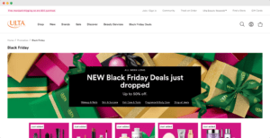
1. Ulta Beauty
(Image source – Ulta)
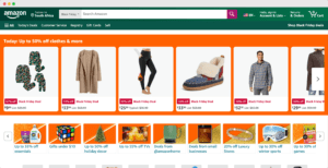
2. Amazon
(Image source – Amazon)
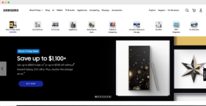
3. Samsung
(Image source – Samsung)
4. Adobe
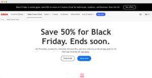
(Image source – Adobe)
5. Superbalist
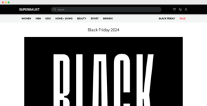
(Image source: Superbalist)
6. Udemy
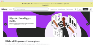
(Image source: Udemy)
Our Last Thoughts
Getting Black Friday right in the digital world comes down to good preparation and optimisation. Our 5-step plan walks you through the essentials, from knowing your audience to tweaking key pages and running crucial site tests.
It’s not just about making sales; it’s about offering a smooth experience, building relationships, and boosting your brand’s visibility. From the first click to checkout, every interaction defines your brand. Black Friday isn’t a choice—it’s a must for businesses navigating the digital shift.
Optimise your site, make your promos hit home, and ensure a top-notch user experience. Wishing you a successful Black Friday season!
Need help preparing your website for Black Friday? Contact us!


