Imagine everyone having equal access to information online. That’s the power of website accessibility! It ensures your website is usable by everyone, including those with disabilities.
Accessibility audits are more than just doing the right thing. They unlock benefits like reaching a broader audience (think millions of potential customers!), improving user experience for everyone, and even boosting your SEO. Plus, depending on your location, they might be legally required.
This beginner-friendly guide will equip you with the tools and knowledge to conduct your own website accessibility audit. Let’s build a more inclusive online world, one website at a time!
Understanding Web Content Accessibility Guidelines (WCAG)
The WCAG are the international standard for website accessibility, developed by the World Wide Web Consortium (W3C). They are a roadmap for creating websites that everyone can use. WCAG outlines a variety of success criteria that address different aspects of accessibility, such as keyboard navigation, screen reader compatibility, and clear visuals.
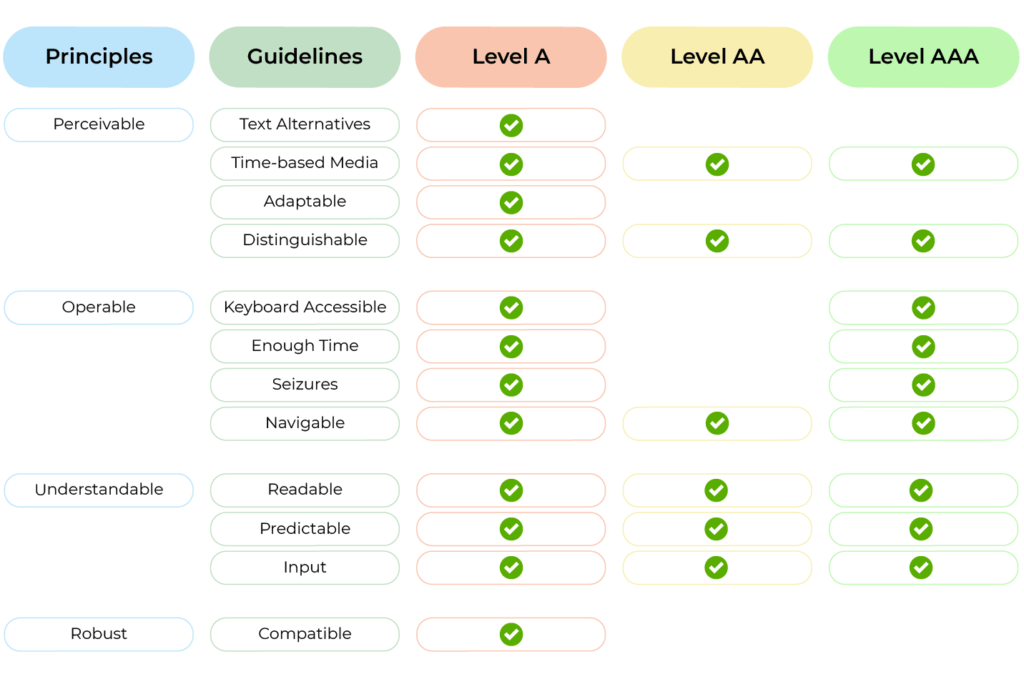
WCAG comes in three compliance levels: A, AA, and AAA. A represents the most basic level of accessibility, while AAA represents the most comprehensive. These principles focus on four principles. WCAG states your website must always be:
- Perceivable
- Operable
- Understandable
- Robust

Image source: Open Classrooms
For beginners, achieving a solid foundation in WCAG compliance is a great first step. This guide will focus on core WCAG principles that will improve the accessibility of your website. As you become more familiar with accessibility best practices, you can explore achieving higher WCAG conformance levels.
How to Prepare Properly for Your Accessibility Audit
Before starting your website accessibility audit, gathering some information and equipping yourself with the right tools is important. This preparation will help you conduct a more efficient and thorough audit.
Here’s what you’ll need to do to get started:
1. Gather Information
- Sitemap: Having a sitemap provides a clear overview of all your website’s pages, ensuring you don’t miss anything during the audit.
- Content inventory: This is a list of different content types on your website, such as text, images, videos, and forms. Knowing what content you have helps you tailor your testing approach.

2. Assemble Your Toolkit
The good news is there are plenty of free and beginner-friendly tools to help you conduct your website accessibility audit. Here are a few essentials:
- Automated testing tools:
- WAVE (Web Accessibility Evaluation Tool): A free online tool from WebAIM that analyses your website code and identifies potential accessibility issues.
- aXe (Accessibility Engine): Another free online tool by Deque Systems that provides a detailed report on accessibility errors and recommendations for improvement.
- Lighthouse (Chrome DevTools): A built-in extension within the Chrome browser that audits web pages for performance, best practices, and accessibility. It offers basic accessibility checks and highlights potential areas for improvement.
- Browser extensions:
- Web Developer Toolbar: This Firefox extension provides a variety of accessibility testing tools, such as colour contrast checkers and screen reader simulations.
- HeadingsMap: A Chrome extension that visualises the heading structure of your website, allowing you to check for a clear and logical hierarchy.
These tools are fantastic starting points! They can quickly identify a wide range of accessibility issues, saving you valuable time during the audit.
Conducting the Audit: Unveiling Accessibility Issues
Now that you’re prepped and ready, let’s get into the heart of the audit: testing your website for accessibility. We’ll focus on some key WCAG principles that beginners can easily grasp.
Manual Testing
Keyboard Navigation
What it is: Keyboard navigation refers to the ability to control and interact with all website functions using only the keyboard (Tab key, arrow keys, Enter key).
Why it’s important: Users with motor impairments or those who rely on screen readers may not be able to use a mouse. Implementing keyboard navigation ensures everyone can access and interact with your website.
How it benefits accessibility:
- Allows users who cannot use a mouse to navigate and interact with your website independently.
- Improves overall usability for everyone by providing an alternative navigation method.
How to test:
- Try navigating through your entire website using only the keyboard. Can you access all interactive elements like menus, links, buttons, and forms?
- Ensure the focus indicator (usually a highlighted outline) is clear and visible when navigating with the keyboard.
How to improve:
- Ensure all interactive elements have keyboard focus.
- When navigating with the Tab key, elements should be focused in a logical order, allowing users to move predictably through the page.
- Use clear keyboard shortcuts where appropriate (e.g., “S” to skip to search).
Screen Reader Compatibility
What it is: Screen readers are software programs that convert on-screen text into audio for users with visual impairments.
Why it’s important: People who are blind or visually impaired rely on screen readers to access and understand website content. If your website is not compatible with screen readers, it becomes inaccessible to this user group.
How it benefits accessibility:
- Allows users with visual impairments to access and understand website content independently.
How to test:
- Use a free screen reader extension or simulator for your browser (e.g., Screen Reader, NVDA). Navigate your website with the screen reader and listen to how it interprets the content and structure.
- Can the screen reader clearly announce all interactive elements and navigate the website structure logically?
How to improve:
- Use clear and semantic HTML code. Screen readers rely on the underlying code to understand the meaning and purpose of content.
- Provide alternative text descriptions for images (see next point).
- Use clear and concise language throughout your website content.
Colour Contrast
What it is: Colour contrast refers to the difference in brightness between text and its background colour.
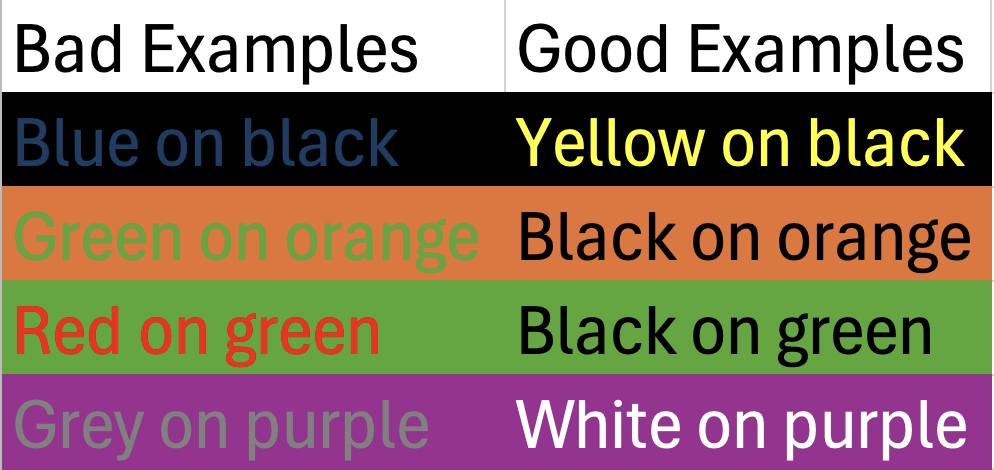
Why it’s important: Over 16 million people in the UK have a disability. People with visual impairments, including those with low vision or colour blindness, may struggle to read text with poor colour contrast. Ensuring sufficient contrast improves readability for everyone.

How it benefits accessibility:
- Improves readability for users with visual impairments.
- Enhances overall user experience for everyone.
How to test:
- Use online colour contrast checkers (like WebAIM’s Contrast Checker) to measure the contrast ratio between text colour and background colour. WCAG recommends a contrast ratio of at least 4.5:1 for normal text and 3:1 for large text.
How to improve:
- Use a colour contrast checker to choose background and text colour combinations that meet WCAG recommendations.
- Consider using a colour contrast checker extension for your browser to check contrast on the fly.
- Offer alternative colour schemes for users who may prefer high-contrast themes.
Alternative Text for Images
What it is: Alternative text (alt text) is a brief description of an image that is inserted into the HTML code of a webpage.
Why it’s important: Screen readers cannot interpret the content of images. Providing alt text allows screen reader users to understand the meaning and function of the image within the context of your webpage. Additionally, alt text is displayed in place of images if they fail to load for any reason, ensuring everyone has access to the information conveyed by the image.
How it benefits accessibility:
- Allows screen reader users to understand the content and purpose of images.
- Improves SEO as search engines can use alt text to index your images.
- Provides a fallback if images fail to load.
How to test:
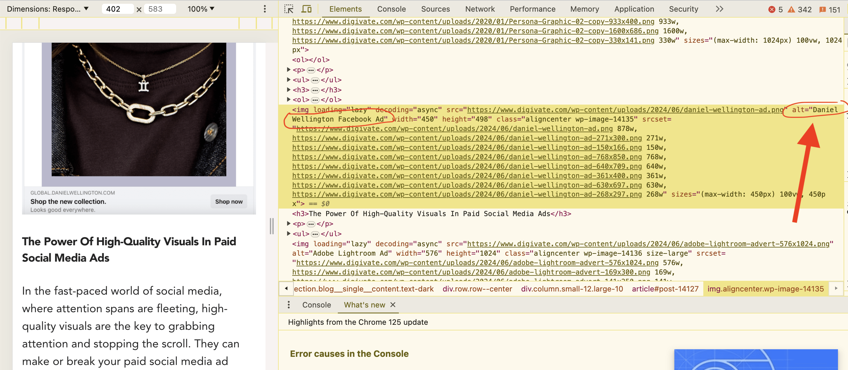
- Right-click on an image on your webpage, click “Inspect” and check if there is alt text associated with it. If not, or if the alt text is empty or generic (“image001.jpg”), you’ll need to add a descriptive alt text in the media library of your CMS.

How to improve:
- Write clear and concise alt text that describes the content and function of the image in a few words (ideally under 125 characters). Do not keyword stuff.
- Avoid using generic descriptions like “image” or “photo”.
- Focus on the essential information conveyed by the image. For example, instead of “Picture of a red apple”, use “A red apple sitting on a wooden table”.
- If the image has text within it, include that information in the alt text as well.
Headings Structure
What it is: Headings are used to structure and organise the content on your webpage. They act like headlines, breaking down your content into sections and helping users understand the hierarchy of information. Headings typically use HTML tags like H1 (main heading), H2 (subheadings), H3 (sub-subheadings), and so on.
Why it’s important: A clear and logical heading structure is crucial for both website navigation and accessibility. Users can quickly scan headings to grasp the overall content and find specific sections of interest. Additionally, screen readers rely on headings to understand the organisation of the webpage and navigate through the content effectively.
How it benefits accessibility:
- Improves website navigation for all users, including those who rely on screen readers.
- Enhances the overall user experience by making content easier to understand and scan.
How to test:
- Review the heading structure on your webpage. Do the headings follow a logical hierarchy (H1 for the main title, followed by H2s for subheadings, and H3s for sub-subheadings)? Can users easily understand the flow of information based on the headings alone?
How to improve:
- Use headings to structure your content into logical sections.
- Start with one H1 tag for your main webpage title.
- Use H2 tags for subheadings within the main content area.
- Follow a logical hierarchy, nesting subheadings (H3) within H2 sections as needed.
- Avoid skipping heading levels (e.g., going straight from H1 to H3).
- Ensure your headings accurately reflect the content they introduce.
Automated Testing Tools
While manual testing is essential for a thorough website accessibility audit, automated tools (which we spoke about previously) can be powerful allies. These tools can quickly scan your website code and identify various accessibility issues, saving you significant time and effort.
Think of them as a first line of defence, highlighting potential problems for you to investigate further with manual testing.
Here are some key benefits of using automated tools:
- Efficiency: Automated tools can analyse vast amounts of code in a fraction of the time it would take for manual testing.
- Comprehensiveness: They can identify a wider range of accessibility issues based on pre-defined criteria.
- Consistency: They ensure consistent testing across different web pages on your website.
It’s important to remember that automated tools are not a replacement for manual testing. They may miss certain issues or flag false positives that require human evaluation.
How Best to Fix The Issues You Find
Oh no! You’ve identified accessibility issues on your website. Now it’s time to prioritise and fix them.
Not all accessibility issues are created equal. Some may significantly hinder usability, while others might be minor inconveniences. To make the most efficient use of your time and resources, prioritise the issues based on their severity and impact:
- Severity: How serious is the issue? Does it completely block access to a specific function, or is it more of a cosmetic concern?
- Impact: How many users are likely to be affected by the issue? Issues impacting a large user group or core functionalities should be addressed first.
Once you’ve prioritised your list, it’s time to tackle the fixes. Many accessibility issues can be resolved with relatively simple code changes or content adjustments.
If you’re feeling overwhelmed or unsure about tackling certain fixes, don’t hesitate to seek help! Many web design agencies (like us) specialise in accessibility and can provide expert assistance in implementing the necessary changes. This can be a great option for complex issues or if you want a comprehensive accessibility overhaul for your website.
BBC: An Example of Great Website Accessibility

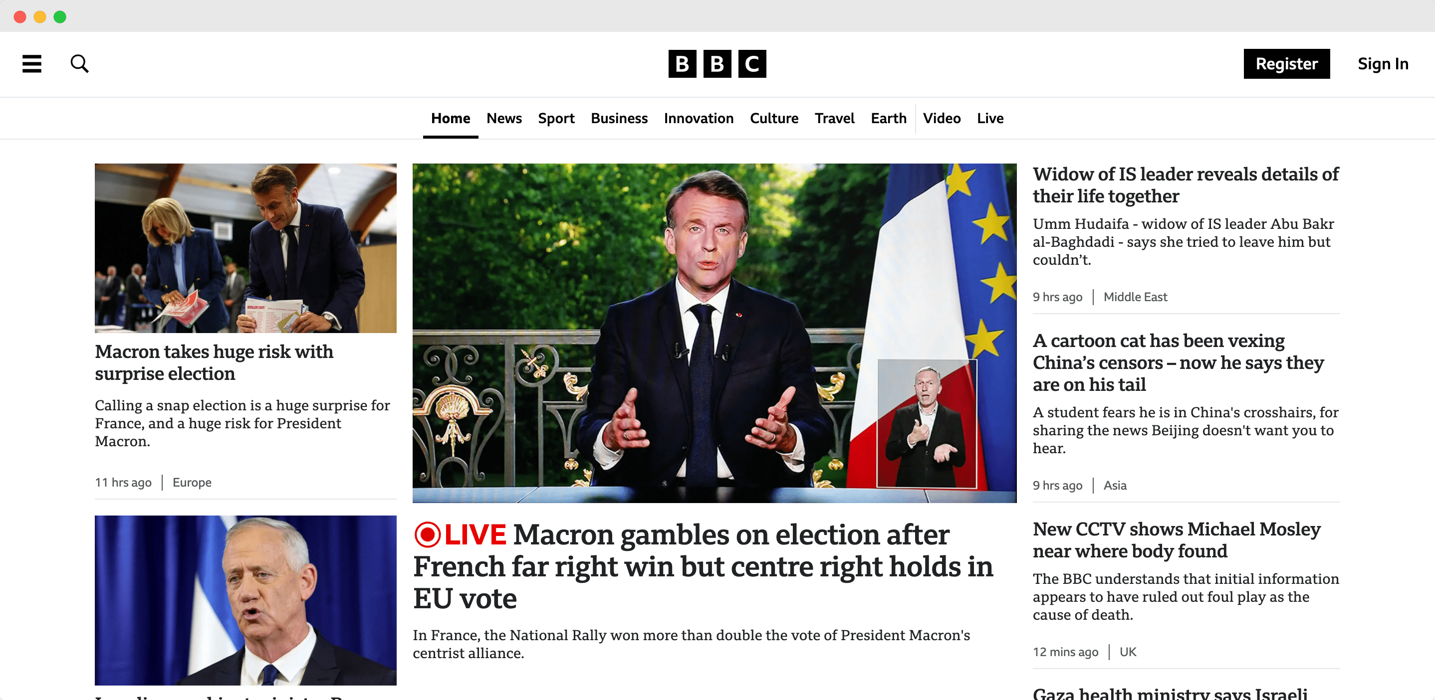
The BBC website stands out for its user-friendly design, making it a leader for both news sites and websites in general.
The BBC excels in providing a smooth keyboard navigation experience. By simply pressing the tab key twice, users can jump directly to the main content, bypassing the navigation bar. Another tab press reveals an “Accessibility Help” section, offering valuable resources for users who need them. Plus, their colour contrasting black text and white background make it easy for anyone to read.
These features and their written accessibility guidelines showcase the BBC’s dedication to creating content for everyone.
Accessibility testing tools consistently give the BBC high marks. By prioritising this aspect, the BBC demonstrates its commitment to a wider audience, fostering stronger brand loyalty.
Conclusion
Website accessibility audits are not just about ticking boxes; they’re about creating an inclusive online experience for everyone. By identifying and addressing accessibility barriers, you open your website to a wider audience, enhance user experience for all, and potentially boost your SEO.
Now that you’ve completed your first accessibility audit, here are some tips for maintaining accessibility and making it an ongoing practice:
- Regular audits: Schedule regular audits (e.g., quarterly or biannually) to catch new accessibility issues as your website content and functionality evolve.
- Accessibility testing tools: Integrate automated accessibility testing tools into your development workflow to identify potential issues early on.
- Accessibility training: Educate your development team on WCAG guidelines and best practices to ensure accessibility is considered throughout the development process.
- User testing: Include users with disabilities in your user testing to gain valuable insights and identify any accessibility roadblocks they encounter.
Remember, accessibility is an ongoing journey, not a one-time fix. By integrating these tips, you’ll be well on your way to building a truly inclusive website that welcomes everyone. Happy auditing!
Looking for help with your web accessibility? Contact us today!


