Many businesses spend thousands driving traffic to their homepage. Fewer businesses do the work to ensure those who arrive go on to buy.
Your homepage needs to pull users in, tell them what you offer, and encourage them to take the next step, all within seconds. But it can be difficult to do all this without overcrowding the page. And your website designer might not like all of your ideas…
To help you out, we asked our CRO (Conversion Rate Optimisation) specialist to share insights gained from over five years of optimising homepages. It turns out many businesses make the same mistakes – and they’re all fixable!
What is a CRO Specialist?
A CRO (Conversion Rate Optimisation) specialist makes targeted changes to web pages to increase the percentage of website visitors who take a desired action. This might be buying something, subscribing to your mailing list, or completing a contact form.
Our CRO specialist Tudor uses a combination of data analysis, user behaviour research, and A/B testing to improve the effectiveness of websites and apps.
The 5 Most Common Homepage Mistakes
1. Putting an unclear value proposition on the hero banner
It has become common practice to put your business’ value proposition in big letters at the top of your homepage. Why? Because when a visitor arrives on your homepage for the first time, they want to understand what you can offer them.
A good value proposition conveys the unique benefits of your products or services in as few words as possible.
We’ve put some examples from different industries below. Take a look at our recent blog post, ‘Why Most Value Propositions are Terrible’ for more. (The examples are good ones!)
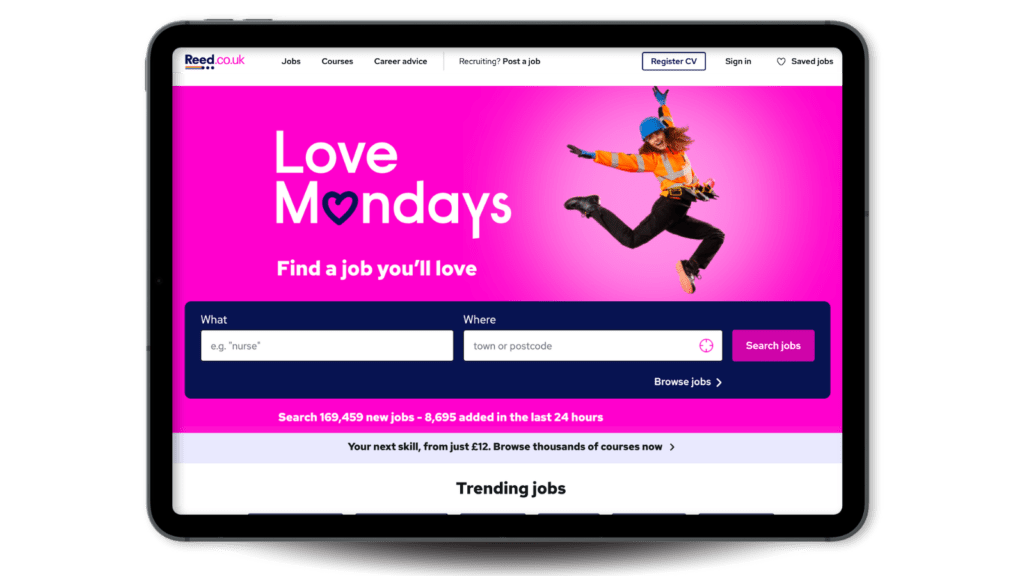
- Reed (Recruitment): ‘Love Mondays. Find a job you’ll love.’
- Patch (eCommerce): ‘Plants made easy.’
- Airtasker (Marketplace): ‘Post any task. Pick the best person. Get it done.’
If your value proposition is vague or confusing, users won’t engage with your content and they’re far less likely to convert. If you don’t include a value proposition at all, you’d better have a good reason why!

2. Featuring an image that doesn’t connect with your value proposition
Images are powerful in setting the tone and building expectation in the user. Any images on your homepage should reinforce your main message and emotionally connect with the viewer. But the hero image (the one users see before scrolling) is the most important.

Reed’s homepage is a great example. It features an image of a woman in a construction uniform jumping in the air as though celebrating. A huge plus is that she’s looking towards the value proposition, which prompts the user to look at it too. The image perfectly supports the message, ‘Find a job you’ll love.’
Many brands go for style over substance and choose an image that doesn’t add any value. Here are some examples of what makes a good hero image:
- People using your products or services (preferably smiling).
- A visually appealing photo of a bestselling product.
- An employee or member of your team looking straight ahead or towards the first header.
- An emotive image that suggests how a customer might feel after using your business.

3. Failing to provide a clear call to action (CTA)
You probably don’t want visitors to just stay on your homepage. But don’t expect them to know where to go next. Even if you have a clear menu, offering an attention-grabbing CTA button will mean more visitors journey to your service or product pages.
A good call to action is short and specific and starts with a verb. View all jewellery. Explore our decorating services. Book a free consultation.
Don’t hesitate to put it above the fold. Users very often scroll down a homepage and then return to the top to click the CTA button.

4. Not demonstrating social proof
People like doing what they see others doing. That’s why the psychological principle of social proof is so important for marketers.

‘Social proof, like review ratings, builds trust and credibility. Not displaying it prominently (above the fold) means missing an opportunity to establish trust at the first glance.’ – Tudor Cioaba, CRO Specialist
There are many ways to demonstrate social proof on your homepage:
- Include a reviews widget from a service like Google My Business or Trustpilot. Ideally, it will show how many ratings you have, not just the number of stars.
- Feature user-generated content (UGC). This could be from social media or images/videos customers have sent to you.
- Include images of clients or customers visiting your offices or in-person stores.
- Share testimonials or written reviews. Include a full name and image of the person who provided it if possible.

5. Hiding away your authority elements
It’s important to show users that you’re great at what you do, rather than telling them. Authority elements like client logos or accreditations showcase your business’s credibility and reputation. Many websites tuck these elements away when they should be front and centre.
Users might not actively look for elements like these, but they have a significant impact on the subconscious – especially when they’re missing!
Read more about behavioural economics marketing →
Feature authority elements like these near the top of your homepage:
- Logos of your clients or organisations you’re affiliated with.
- A ‘featured in’ section showing media mentions of your brand.
- Images of your team or employees in clothing that signals authority within the field, e.g., a doctor’s uniform for a health business or a suit for a law firm.
- An image of your office or store.
- A quote or video from an influencer or big name within your industry.

Find out how to optimise your homepage
We offer a CRO audit of your homepage with clear steps to improve your conversion rate. Our CRO specialist works alongside our Development, SEO and Content teams to get you more business from your existing traffic.
Interested in a free consultation?


