The people who browse your eCommerce website are not logical. They are emotional, biased and hardwired to behave a certain way online.
At Digivate, we analyse user psychology and help our clients make better marketing decisions. A lot of these decisions may seem trivial:
- How to word your value proposition
- Where to include reviews to boost social proof
- How to structure your product page
But it’s these little choices that make your users behave the way you want them to.
Explore our Conversion Rate Optimisation services
So, here are the 11 weird things people do when shopping online:
1. Add items to their cart and then just leave
Cart abandonment – why do they do it? Unfortunately for lovers of the quick fix, there can be many reasons:
- The checkout process is excessively complicated.
- Unexpected shipping or service costs.
- They were treating the basket as a wishlist.
- Putting it into the basket was a big enough step – they’re not ready to actually buy it.
- They want to see if they can find a discount … or a lower price with one of your competitors.

Here are some ways to reduce your cart abandonment rate:
- Get a CRO (Conversion Rate Optimisation) specialist to streamline your checkout process.
- Include shipping costs on product pages and offer free delivery if users sign up for your mailing list. (This offer should be visible on the checkout page). Additionally, optimise your deliveries using route planning software to ensure timely and efficient service.
- Set up automated email flows to remind customers about the items they’ve left in their cart. You could even offer an incentive for completing the checkout process.
2. Ignore anything that doesn’t align with their first impression
Heard of confirmation bias? Yep, it applies to eCommerce too. Users will favour information that supports their initial impression of your business and disregard the rest.
An example: You’re called out in the news for unsustainable practices. You resolve the issue and include a message on each product page with your sustainability pledge. Users might take note of this, but the beliefs they formed when the article came out will still control their overall impression of your company.
That’s why it’s so important to define your brand identity and values from day one.
3. Read your page in an F shape
If you have the budget to do eye-scan testing on your website, that’s awesome. It will show you where users’ eyes are drawn as they navigate your site and help you optimise it.
If not, bear in mind that most users’ gaze follows an F pattern when they browse a site. They’ll prioritise information at the top of the page and scan left to right, but as they get further down the page they’ll focus on the left.
How can you benefit? Put key information at the top of the page and use plenty of white space as you get into paragraph copy. Customers will read more of your key copy and be more likely to convert.
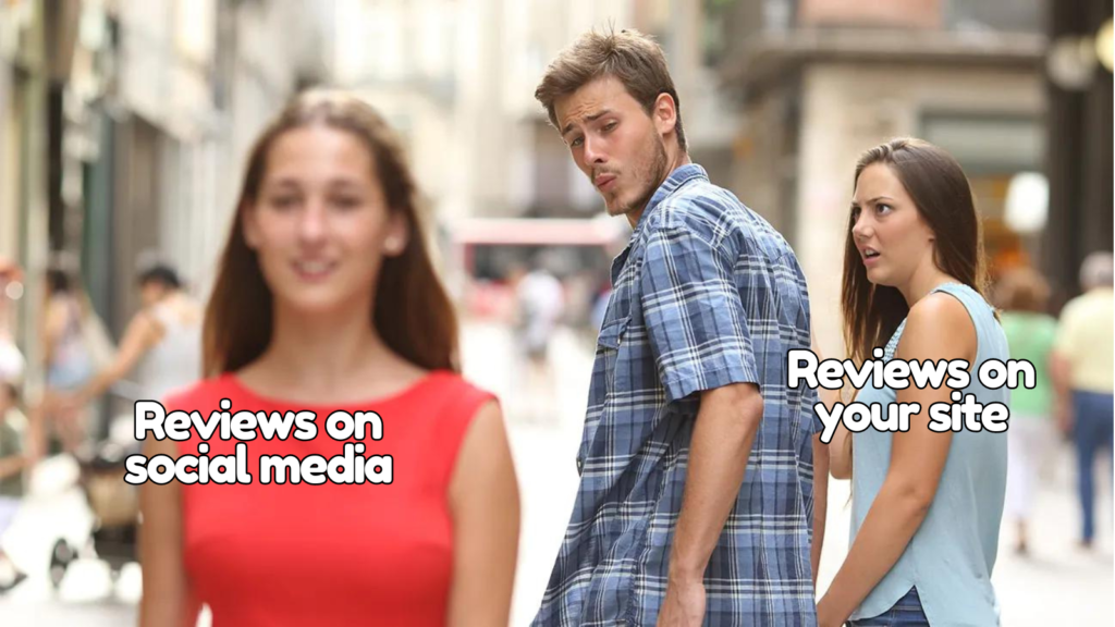
4. Go to social media to find reviews, even if you’ve got reviews on the site
Acquiring ratings and reviews for your website is crucial. But many users still want confirmation from an external source.
88% of Gen Zs and Millennials use social media to research products they’re interested in buying. (Exploding Topics). Though they’re interested in influencer recommendations, they’re most keen to see user-generated content. It’s the principle of social proof. Also, they much prefer photos and videos to text-only recommendations.

What should you do about this? Don’t just sit back hoping social proof will appear out of thin air. Actively encourage your customers to post images and videos with your product by offering prize draws or freebies. Share this content to your profile – sure – but make sure it comes from the customers.
Top tip: Once you’ve secured this user-generated content, add it to your product pages to further boost your social proof.
5. Buy something because you gave them something free
Reciprocity: one of marketing’s favourite psychological principles.
The gist is this. If you give someone something, they will feel indebted to you and find a way to pay you back. Often with a lifetime of customer loyalty!
Free samples and trials don’t just work because customers get to try your product. They literally feel obligated to buy your stuff.
It doesn’t have to be free products. Give your time. Give your expertise. Give what you can and reap the rewards.
6. Avoid items that no one else is buying
We all love a sale, right? Right? Actually, lots of people view end-of-season sale items as stuff nobody else wants. Even if they personally love an item, they’ll view it as having less value.
Not everyone thinks this way. But it’s important to know that a cheaper price isn’t always the answer. Also, running the odd whole-site discount from time to time can be a great way to pull in the sale-averse.
This principle also works in reverse. People like to buy items they know are popular. How you can benefit from this:
- Include a ‘bestsellers’ category on your site.
- Show when particular items are trending or high in demand
- Feature user-generated images of your top products on social media
- If you use influencers, ensure they’re promoting your bestsellers

7. Buy stuff just because it’s low in stock
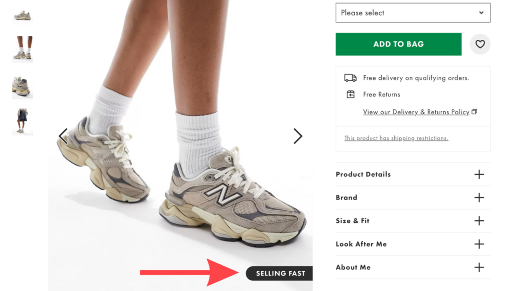
Scarcity is hot. People will buy ‘low in stock’ products because 1. they appear more desirable, 2. they’re worried about missing out, and 3. they’re forced to make a snap decision.
Robert Cialdini says, ‘Scarcity amplifies the power of persuasion and can lead people to make impulsive decisions.’
Tell users which items are low in stock. Don’t rush too fast to restock sizes – but make sure you offer to send shoppers an email when their size is back.
Also, consider running presales, limited edition runs and exclusives.
Expert tip: Use a multi-stop route planner to streamline deliveries for high-demand products, ensuring they reach customers quickly and efficiently.
8. Click on your ad only once they’ve seen it at least three times
Repetition is key to getting a message in a user’s mind. Don’t expect one ad to do the trick or feel you need to differentiate the message each time.
Do:
- Put budget into retargeting campaigns
- Back up the message of your ad on your landing page
- Reinforce your message across your channels – email, social, the lot.
9. Reject items that are cheap – unless it’s clear they’ve stumbled upon a one-of-a-kind deal nobody else has noticed.
Regardless of sale or in-season, people tend to value an item according to the price. If they’ve budgeted £80 for an item and find a decent-looking option available for £40, they’ll assume it’s not as good as others on the market.
Many businesses are constantly striving to undercut their competitors’ prices. But in reality, some people want to pay more.
“Because people form assumptions and associations based on your pricing, and your pricing shapes what people believe about your service, it’s important to be clear about how you position yourself. Your price should be aligned with the extremes you claimed as part of your positioning.” – Seth Godin
Remember that your shoppers have an idea in their heads of what an item should cost. If the item is significantly less than this, they’re likely to stay away. Unless for example, you’re running a limited-time exclusive offer.
10. Do what they’re told
People generally like doing what they’re told. That’s why clear calls to action (CTAs) are so important.
People especially like doing what they’re told if you appear to carry authority.
There are many ways to signal authority:
- Titles – Think of Apple giving its store staff the title ‘genius’. Are they actually geniuses? No, they’re uni dropouts and keen seventeen-year-olds. But the name leaves an impression on you.
- Clothing – Why not include a picture of your CEO in their nicest suit? Or, if you work for a media company, something a bit cooler like a custom printed t-shirt, perhaps? Include whatever cues you can to signal authority within your field.

11. Ignore a product they love because they don’t like the website’s design
One of psychologist Robert Cialdini’s top principles of persuasion is ‘liking’. People buy from people (and businesses) they like.
But in eCommerce, there are a lot of factors that determine whether a specific user likes you. And a key one is your website’s design. It couldn’t be more important that your site appeals to your target user.
Your target user might like a clean and minimal design or something more funky. You’ll have to do some user research to find out. The bare minimum for everyone, though, is a site that is professionally designed and easy to navigate.
When you need a Conversion Rate Optimisation specialist
You usually don’t know why your users aren’t converting. You just know that your bounce rate is high or your product sales are low.
A CRO specialist, though, can tell you the specific things that put users off and design wireframes with true conversion power.
Book a free consultation and find out how to make the most of your users’ online shopping habits.


