When a user lands on your website for the first time, they make a lot of snap judgements about your business. Many of these are subconscious. But when it comes to how much they trust you, these judgments determine whether or not they’ll get in touch or buy your stuff.
Trust signals are the subtle indicators that reassure users you’re a legitimate, reliable company. Whether you’re running an e-commerce store, a blog, or a service-based business, the right trust signals can make or break your conversion rate.
In this post, we’ll go through the 11 essential trust signals you should have on your website. Learn to build confidence with your audience and drive more conversions.
1. Contact details
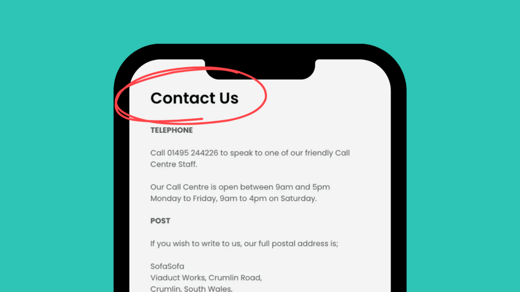
Sharing your contact details helps users place trust in the real people behind the website. You can increase your conversion rate by providing an easy way for users to resolve any issues or doubts – but even if they don’t get in touch, seeing that you’re willing to be contacted makes a difference.
Try to include the following contact details:
- Phone number
- Business address
- General enquiries email address
It’s great if you have a live chat feature, but bear in mind that certain users from various demographics will prefer to reach out by phone or email.
2. Customer reviews or testimonials
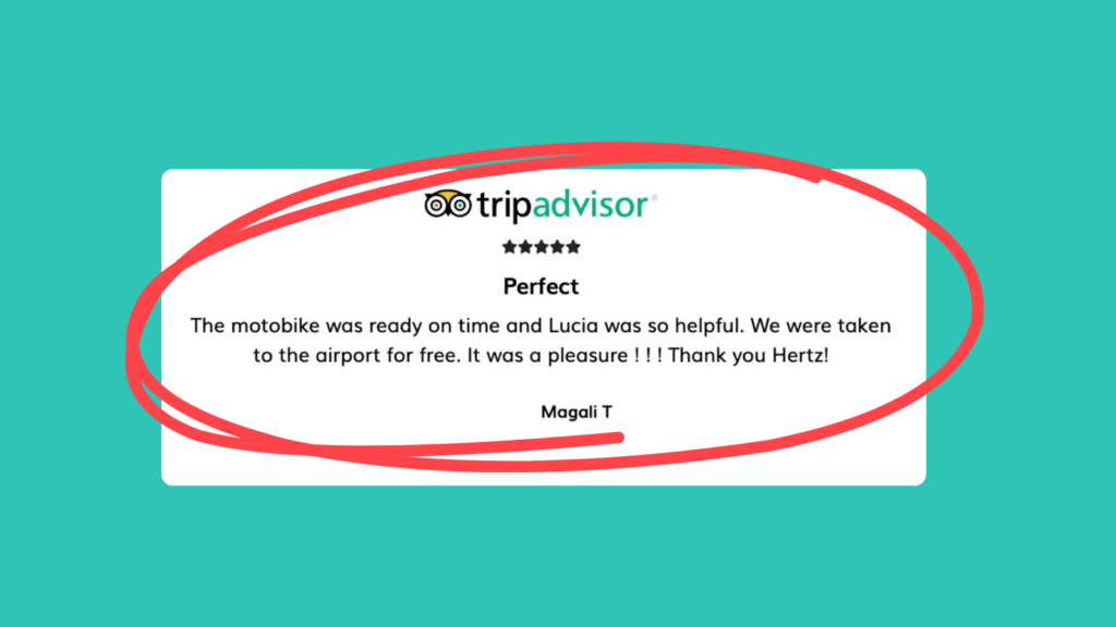
Ensure your product and service pages contain authentic reviews from customers or clients. Using a third-party platform is a great way to show users they’re genuine. It could be Trustpilot, Google, Yelp, or something more industry-specific. In in doubt, take a look at our article on choosing the best review platform for your site.
If you’re posting testimonials you’ve sourced yourself, include a photo, name and relevant detail (e.g. job title, business) alongside the quote. A link to the person’s social media profile also helps to increase trust. (LinkedIn for B2B!)
.
3. Awards and accreditations
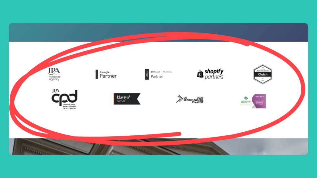
Highlight any relevant awards or accreditations your business has. For example, our ‘Content Marketing Services’ page includes an IPA Member Agency stamp, a Google Partner icon and a certificate for ‘Best Content Marketing Campaign’ at the eCommerce Awards 2023.
If a user hasn’t heard of your business before, a connection to an organisation or competition they have heard of goes a long way.
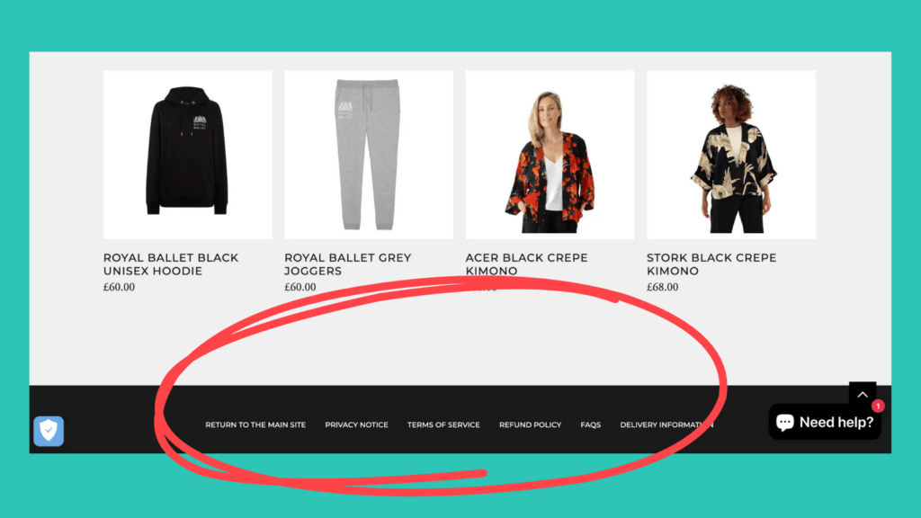
4. Transparent policies
Does your website contain a clearly visible Privacy Policy, Terms & Conditions page, and Delivery & Returns Policy? If not, users may question why.
These don’t need to be incredibly extensive. Usually, users just want to check that they have a fair amount of time to make a return or that they’re not signing over their soul to you if they share their email address.
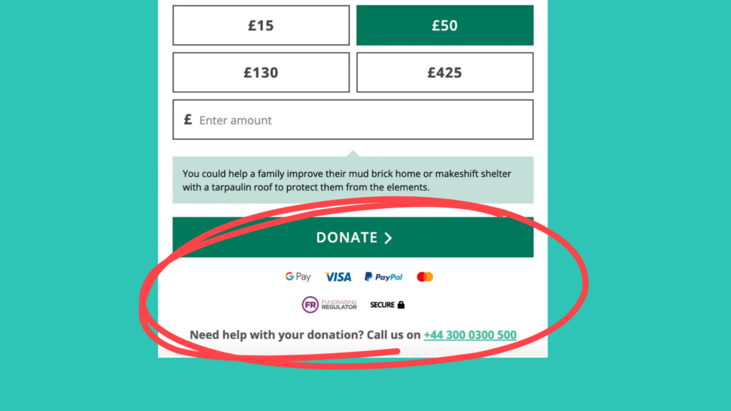
5. Secure payment options
Before a user clicks ‘add to cart’ or ‘checkout now’, they should be able to see the payment options available to them. Most eCommerce sites show icons for Visa, Mastercard, AMEX, PayPal, Klarna, etc., as well as a secure payment stamp. Also, if in a high-risk industry, they need to ensure you are accredited to sell any related goods online, and partner with a reliable credit card processor.
Even if someone is using a common payment method you’re definitely going to accept, these payment icons have an impact. They carry a certain legitimacy and help to reassure anyone thinking of giving you their money.
6. Data security stamps
Visitors also like to know that their information is secured before submitting a form. Including a message saying ‘Your information is 100% secured’ alongside a reinforcing image like a padlock should do the trick. Just make sure their information is 100% secured!
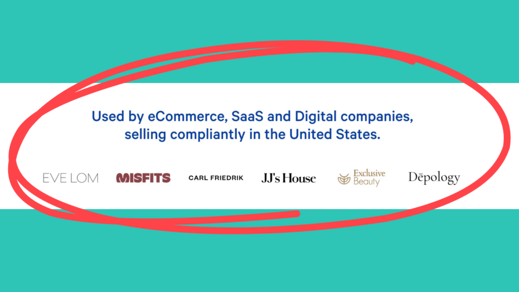
7. Client logos
Social proof has a huge impact on users. If other people are using your business, it must be good. For B2B businesses, including a row of client logos on your pages is a great idea. Try to include a diverse selection. If a visitor spots a company they know and potentially feel they have things in common with, their trust will grow.

8. UGC (user-generated content)
One way for B2C businesses to provide social proof is by sharing user-generated content. Encourage your customers to share pictures or videos of themselves using your product either directly or on social media. Then publish them to your site!
An unedited image of your product in a customer’s home often generates more trust than a polished professional photo. Consider offering an incentive for customers to share UGC – like a discount or an entry into a giveaway.
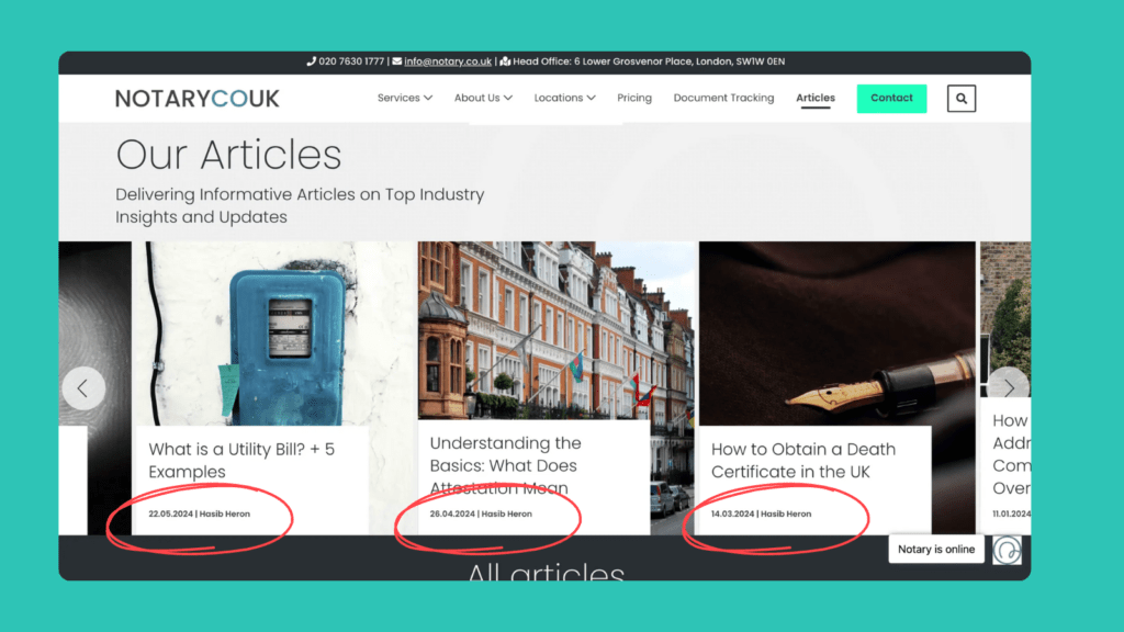
9. Fresh content
Up-to-date content shows that your business is active and engaged. Include dates on your blog posts and aim to publish 2 or more each month. Make sure any information or statistics on your other pages are up-to-date.
You could also consider embedding an active social media feed. It’s another great way to show that you’re operational and thriving.
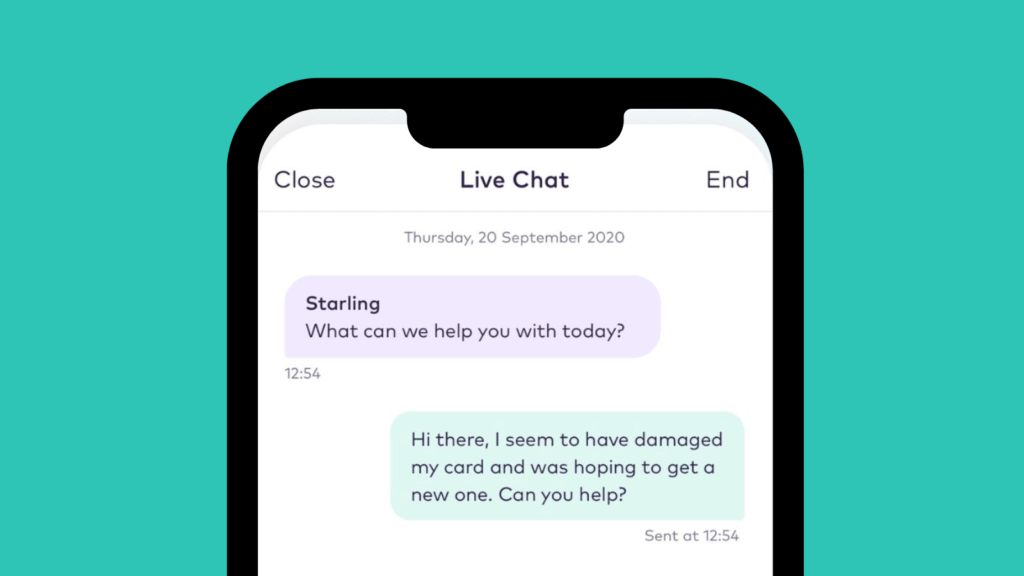
10. A live chat feature
A live chat feature shows that your business is available and ready to help. It offers immediate support, which builds trust with users.
Customers feel more confident knowing they can quickly get answers to their questions – and when they receive those answers, they’re one step closer to converting.
Get users to trust you with our Conversion Rate Optimisation (CRO) services.
Building user trust is a layered process. Once you’ve earned that trust, though, you’ve got the user well and truly on the track to conversion. That’s why trust signals are one of the first points we cover in our CRO (Conversion Rate Optimisation) audits.
Do you want to find out what our specialists think of your website? Get in touch and find out how you can turn more visitors into customers.


